The go-to destination for concerts

How do you manage to promote 100+ artists and 200+ concerts a year? How do we make an artist get the space they demand on a generic platform? How do we make it easy to promote and handle both the musical content and Lugers core business and brand? This was a few of the things we asked ourself when we built the new luger.se

Luger Full Image 2
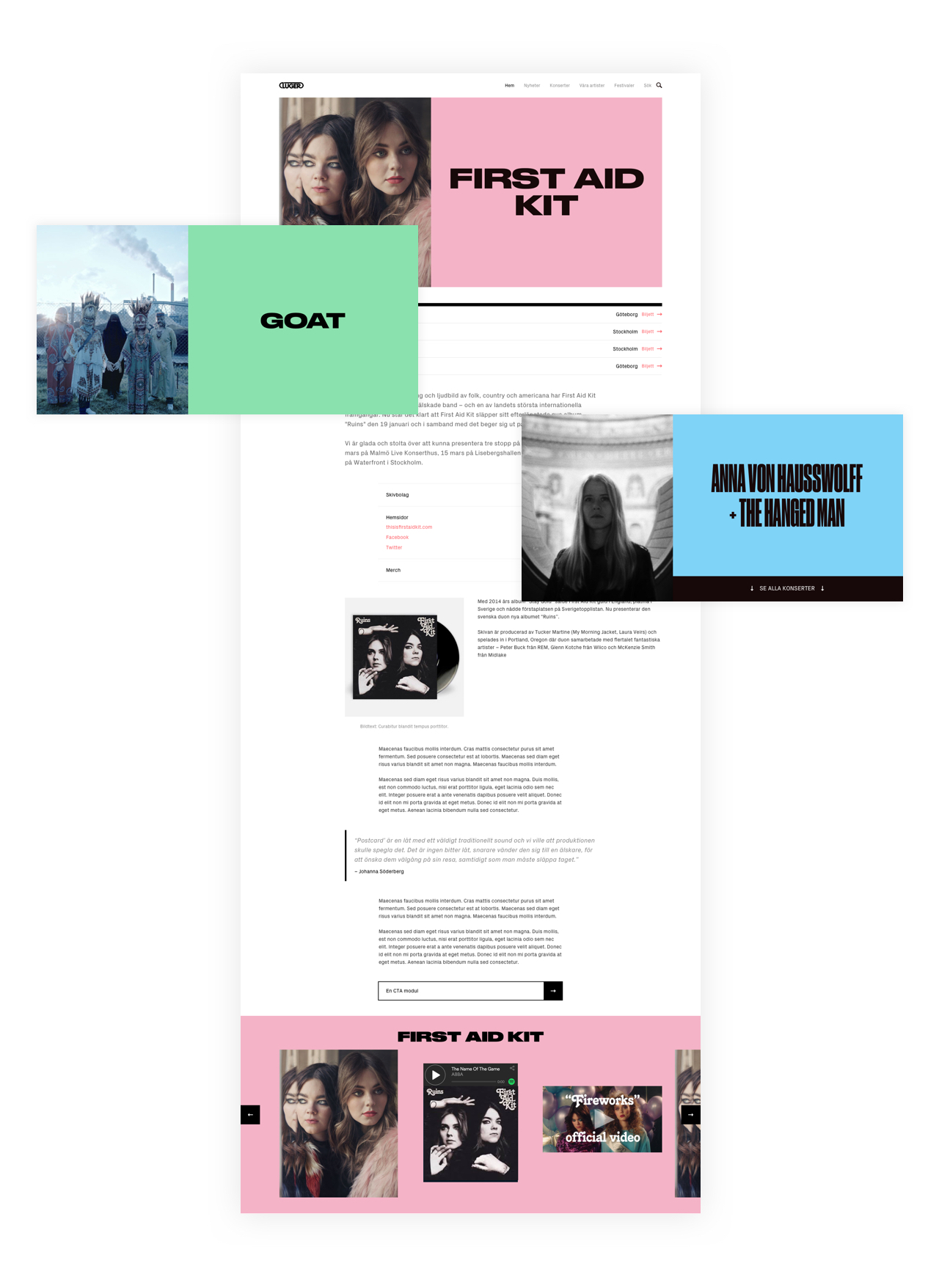
Make the artist stand out

This seems like a no brainer but surprisingly few booking/concert sites is focused around the artist and their content. We changed this by building a much more flexible platform with Craft CMS and a custom modular approach. Luger now has the flexibility to work with the intricate content coming to music and artistry in a whole new way. To integrate third party services such as YT, Spotify and Soundcloud without compromising the structural integrity of the website is a challenge both for designers and developers.

Luger Full Image Artist
Listing artist, concerts and news

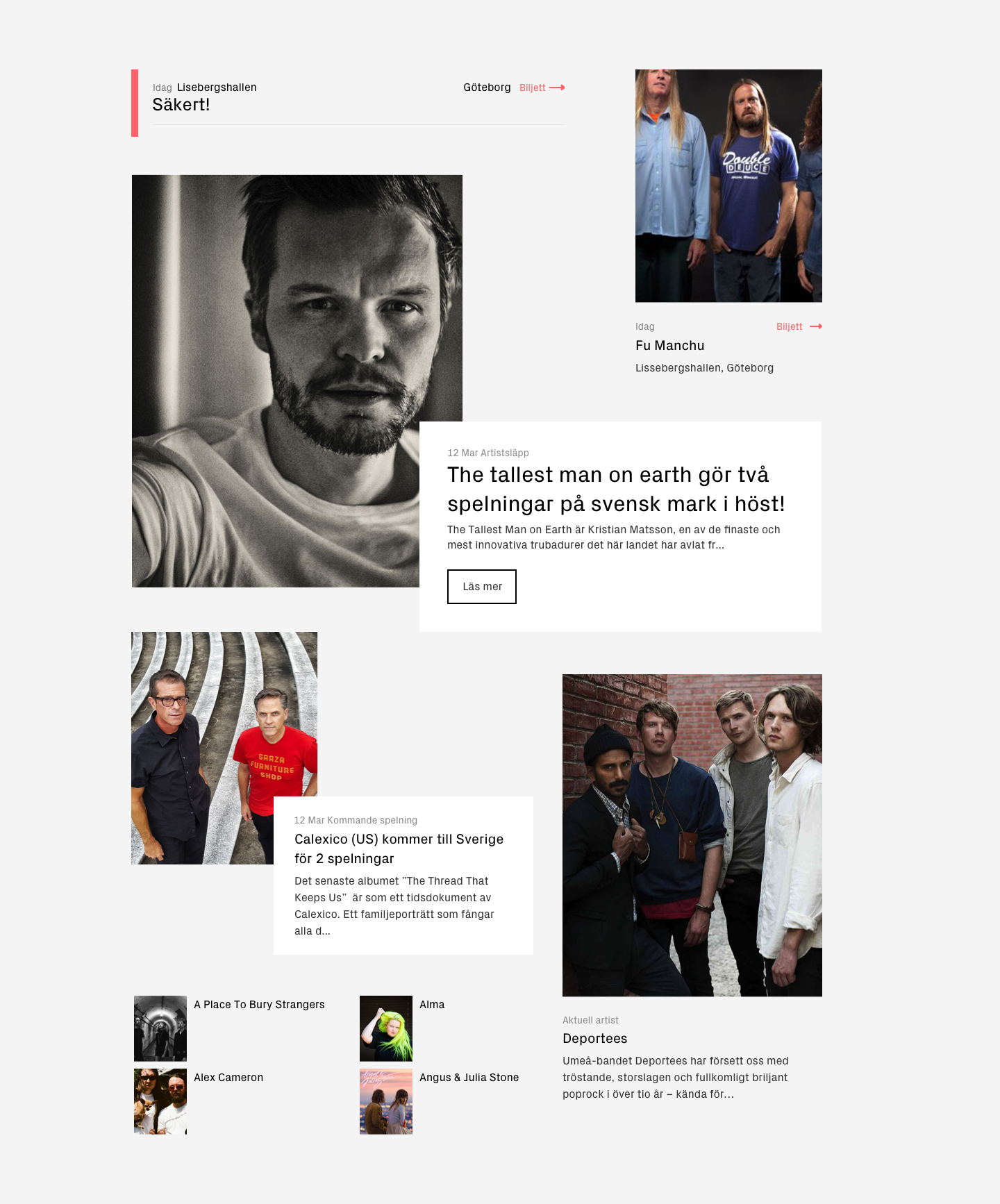
With a lot of activity it was essential that the website could handle many different types of updates some only text based and others much more complex, and that the editor would be able to highlight the most important in a very flexible way. We created a system of dynamic lists and post types for the editor to choose from. The modules are adaptive and match each other seamless however they are arranged.

All components also needed to have a set of principles for interaction that made them feel visually responsive, loading and rollover is therefore holistic.

Luger List 2
Give the identity the space it deserves

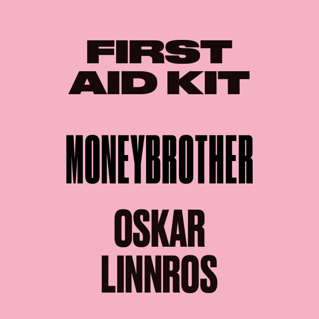
Luger is one of the most diverse concerts managers and booking agents in Sweden with a stand out reputation for quality music. With a new brand identity by acclaimed designers Leon & Chris we wanted the website to reflect and facilitate this heritage. To really understand the implication of representing an identity in a digital environment is core to us. One unique feature is the system and principles for changing font weight based on the letter count in each artist name. The use of Druk as main headlines is featured by Typewolf as a best practice.

Luger 640 1
Luger 640 2 2
One image to rule them all

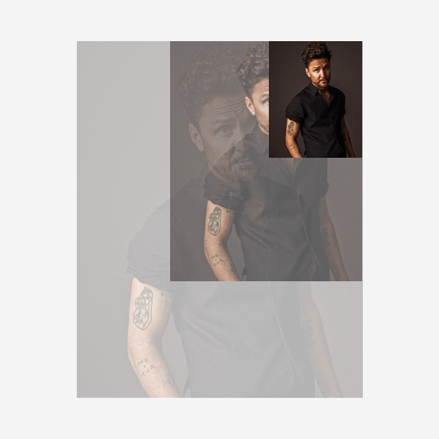
We decided to invent and use one image format (4:5) for the entire site, this became a lifesaver for the editor who can quickly upload new content when time is short without needing to upload new or multiple images. The format is also a perfect fit for mobile devices and the responsive framework that we designed for Luger.

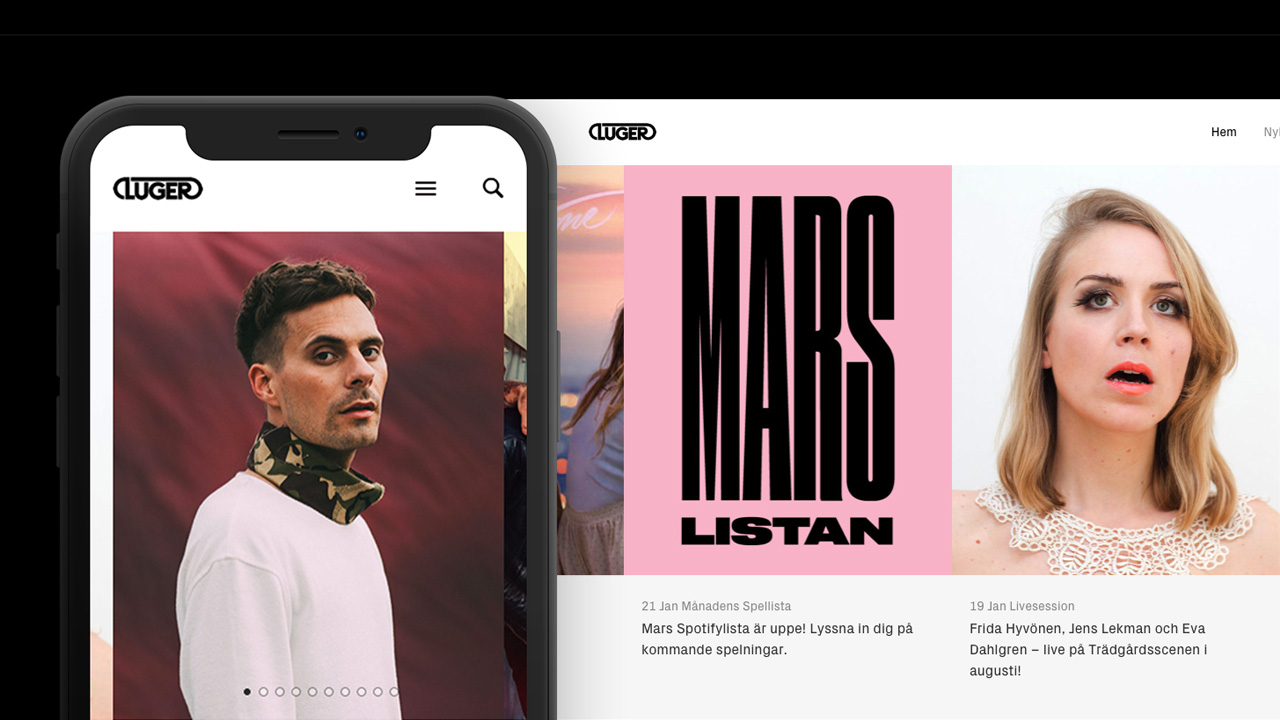
Built for mobile

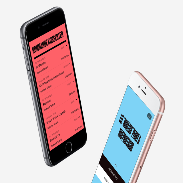
There is no possible way for a brand like Luger to not adapt to a contemporary digital behavior where mobile is a key part of the experience. Therefore mobile is a main component in the design and development of their online platform.

Luger 640 3
This is just the beginning of Luger.se transformation. Stay tuned for more updates.

Do you have a problem to solve?

We work with a wide range of digital products and services, from intricate brand & company websites to hi-fi technical innovations, always executed to the highest of standards. Do you feel inspired? Drop us a line and lets get talking about how we can help you transform your ideas into reality.

Contact us